Thievery makes effective copywriting! How & why you should steal the words of your users

October 9, 2017
The best copywriters are not only creative geniuses but also thieving magpies. They steal words from the people they are trying to persuade, so that they can make use of their language. This is one of their best-kept secrets to getting messages across effectively and writing copy that converts.
We use this technique too. We intentionally steal words and thoughts from prospects and visitors. Using four examples from our projects, we’ll show you how we snoop around like detectives to make sure we snatch the right words. In some cases reformulating a single word can make a huge difference.
How the right words can boost your sales
Many associate copywriting with long, elaborate texts. But even individual words can have an enormous impact on the user experience and it makes sense to pounce on micro-copy that irritates, misleads or distracts your users.
EXAMPLE 1 – How a false word in a navigation bar deceived visitors
The image below shows the navigation bar of a popular language school in Vienna that offers German courses for all ages. Can you spot the tiny change that we made to that section?

The screenshot on top shows the old version of the navigation bar; the one at the bottom shows the new version.
It was a small thing: we removed “16+” on the tab for the adult courses.

Why did we remove “16+”?
After participants had attended the German courses, we asked them for feedback in an e-mail survey. Among other things, we asked them if there was anything that almost prevented them from booking a course at actilingua.com.
Many adult participants were worried that the course offer was aimed at young people. For example, they said:
“ActiLingua presents itself primarily as a school for young people.“
“The courses are mainly for teenagers, not for people my age.“
This was an interesting hint, worth pursuing further. Our research uncovered different reasons causing this (wrong) impression in the heads of the visitors looking around on the website of the language school.
One of them was very trivial and easy to correct.
Users, who wanted to get an overview of what courses are offered, often only saw 16+, 16-19 and 12-17 (the age indications on the tabs) when scanning the homepage. They did not notice the words “adult courses.” To refute the deceptive impression that the site only offers courses for teenagers we simply removed the “16+” from the tab for adult courses.
Example 2 – How a wrong phrase in a navigation bar caused site abandonment
The next example also concerns a fatal phrase in the navigation bar, this time on the website of an insurance company.
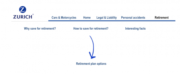
Through user tests, we discovered that users looking for pension insurance on zurich.at had difficulties navigating to the right page. They quickly clicked on the main menu item “Retirement,” but then did not know which of the submenu options to choose.

They often muttered desperately:
“Where do I find retirement plan options?”
It was not clear to them where they had to click next to find the desired info. The submenu item “How to save for retirement” was ignored by most users. Frustrated, they left the page at this point, although the information they were looking for could be found exactly here.
User tests showed us that visitors searched in vain for the phrase “Retirement options” in order to be able to orient themselves further.
The users’ choice of words was therefore adopted to rename the submenu item—”Retirement options” was used instead of “How to save for retirement”.

EXAMPLE 3 – How a tiny change makes product selection easier
The next example is from an Austrian web-to-print company. They offer 60,000 printed products that can be ordered online.
Business cards are a very popular product in the portfolio of druck.at. Customers can choose from a variety of formats, materials and printing techniques, allowing them to print business cards according to their needs.
We noticed in countless user tests that it was relatively easy for visitors to put together a business card according to their needs. They clicked their way through different selection possibilities without problems until they reached a certain point. Only then did they hesitate, voice their incomprehension, and often inadvertently chose an option they did not really want.
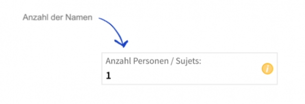
The selection option, that irritated the users was titled “number of names.”

“Anzahl Namen” means “Number of names”.
“I have no idea what they mean by that?“ was the most frequent reaction.
What this selection option meant was the number of persons in a company for whom business cards should be ordered. If more than one person was selected, a name change would be necessary when printing the cards.
In the user tests, it became clear that users would rather describe this selection with the words “number of people”. Professionals who often deal with printing matters, called it “multiple subjects”.
We simply stole the words of the users and named the selection option as the users would do so themselves:

Instead of “Number of names” (“Anzahl der Namen”) the field now is called “Number of persons / subjects” (“Anzahl Personen / Sujets”).
With this minimal renaming, users are no longer confused and understand the selection box’s purpose.
EXAMPLE 4 – How a word in a dropdown menu caused form abandonment
The last example is from the contact page on Zurich insurance’s website. The page is an extremely important page at the end of the conversion funnel, as potential customers are about to contact the insurance company to inquire about one of their products.
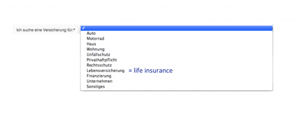
In the dropdown menu, prospects can specify the type of insurance they are interested in. Originally they had the following options to choose from:

Users looking for a retirement plan searched in vain for the word “Retirement plan”. Many did not understand that they were supposed to choose “Life insurance” to get the information they sought.
“Retirement plan …can I find this in ‘Other’ or ‘Financing’? No, it has to be ‘Other’. ‘Other’ is such an unsure thing. But since nothing else fits it has to be ‘Other’.“
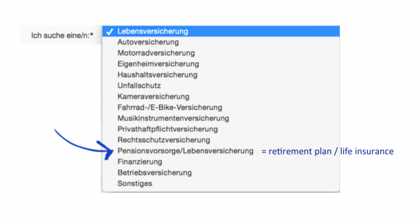
To make the selection easier, we added the term used by most users (“Retirement plan”) as a selection option.

With this minimal change, it was easy to address the users’ needs.
Websites often rely on “company-internal” expressions, especially in the case of navigation labels and selection possibilities in dropdown menus. In most cases though, these are unknown to visitors or are called in a different way in their everyday language. These elements can be easily changed on a website. The only hard part is to figure out which words need to be changed and what you should replace them with…
The best sources to steal the most valuable words and thoughts of users
So how do we find out what words we should use?
Voice-of-customer and voice-of-visitor feedback are abundant sources. These include:
- user tests
- chat transcripts
- customer feedback and complaints
- reviews
- onsite surveys
- email surveys
- logs of search-box queries
- card sorting
Bonus tip: What to keep an eye on during your thieving spree
You should pay particular attention to the following areas as you dig through the countless feedback sources:
Which words go through your visitors’ heads while searching for products on your page? For example, we often see that the menu items are named with company-internal or technical terms that do not make sense to users.
How are users describing products or services in their words? In many cases users mention attributes that convinced them to purchase a product, but these are not yet mentioned on the website.
Which words do visitors pay particular attention to? For example, it is particularly exciting to see which words have an effect on the perception of the quality and price of products and services compared to those of your competitors.
Places where visitors hesitate or drop. We are especially interested in what keeps users from staying on the website. Frequent reasons for leaving a website are unanswered questions and concerns or incomprehension.
How users describe the company’s benefits and USPs in their own terms. We find it interesting, that users often rave about things the company itself would never have seen as something special or worth mentioning.
Conclusion—Every word counts & you do not need to be a professional copywriter to write good copy
Even single words can have a tremendous impact on the user experience and sales. Voice-of-customer and voice-of-visitor feedback are valuable sources that can be used to better understand the thoughts and the “language of your users”. In most cases, it is better to use the users’ expressions—or to be a bit dramatic, to steal their words—than to use expressions that are foreign to them.
In many instances good copy does not need creativity—at least not in the sense of formulating your elaborate texts. Rather, creativity is required to find out how to best listen to customers and research their thoughts in order to learn the words that you should use in your copy.