Beloved & Hated: Rotating Banners On Homepages and Their Impact on Conversions

March 8, 2019
Users hate them, website owners love them. We continually work hard to convince our clients to get rid of them: Our usability studies confirm that in most cases, rotating carousels are not the best use of space. They typically occupy the vast majority of the prime area above the fold on homepages, yet they are ineffective.
Rotating carousels are popular for the wrong reasons
Rotating banners, carousels, sliders – whatever you call them – are visible all over the web today. In our experience, there are two main reasons so many websites use them as a prime element on their homepage:
- Some people think sliders are beautiful and that they give their homepage a modern touch. Ask anyone in your organization to scribble a wireframe for your homepage. Chances are they will come back with a sketch that includes a massive banner on top, often covering the whole area above the fold.
- Very often different departments are vying for space on the homepage, and rotating content is the easy way for designers to appease competing stakeholders. Instead of jointly defining a clear communication strategy, all kinds of messages are simply lumped together and put in rotation.
What usability studies & numbers reveal about rotating carousels
We will use a recent usability study we did for one of our clients to sum up what we have learned about rotating carousels over the past years.
1. Rotating carousels annoy users
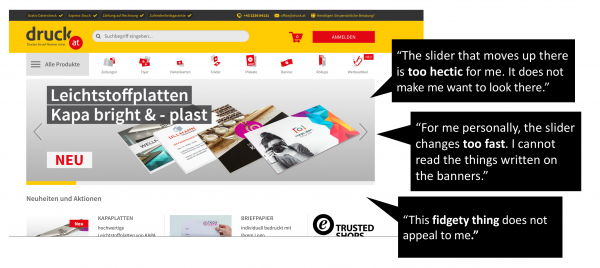
Usability test participants visiting the homepage of druck.at, Austria’s largest online printer, commonly stated that the rotating banner annoyed them.

The feedback did not surprise us for two reasons.
1. Whenever we conduct usability studies on homepages with rotating banners, we get very similar statements. In fact, we don’t recall many usability tests in which test participants did not make a negative comment about a rotating banner.
2. Our findings are very much in line with the results of studies from other UX or conversion rate experts (e.g., see Jakob Nielsen’s study on auto-forwarding carousels).
One solution to avoid annoying users with rotating carousels – that are either too fast or too slow according to their taste – is to make the rotation manual, letting them click to move between slides.
2. The main interaction is with the first image of the rotating banner
Another observation we regularly make is that users only click on the first image, if at all.
In our example from druck.at, only a ridiculously small fraction of total visitors on the homepage clicked on the carousel. Out of those, the majority (>95%) clicked on the image displayed first.
3. Sometimes content on rotating banners gets completely ignored (“banner blindness”)
On most homepages, carousels are used with the intention to inform visitors about news and products and to push visitors further into the site. The images on the slider typically include a call to action and a button that leads to a specific page. Sadly, the messages – even the one on the first image – are often altogether ignored due to a phenomenon called banner blindness. Visitors have adopted a scanning reflex to consciously or unconsciously ignore banner-like information. Moving carousels are affected by this condition.
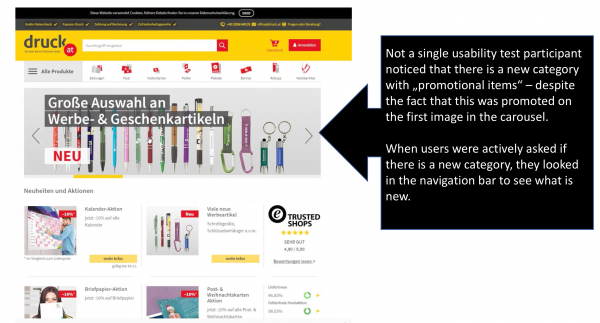
A few months ago, druck.at introduced a new category with “promotional items.” To promote it, a banner was included in the carousel rotation. No one noticed the information about the new category, and when actively asked if there was a new category offered on the website, users would look at the navigation bar that lists all product categories to find it. They all ignored the message on the carousel, even though it was in huge letters on a prime real estate area of the page. This is most likely because it was placed on a carousel slide that was ignored due to the banner blindness syndrome.

The result was very comparable to the results of other studies we have done, in which users overlooked banner-like messages, as well as studies previously conducted and published by others such as the NNGroup that came to the same conclusion after testing a similar case.
With all this in mind, it might not come as a surprise that druck.at removed the rotating banner from their homepage. They replaced it with a much narrower, static banner focusing on one key message.
They took advantage of the extra space available to move the news section – important content for their visitors, as we learned from previous usability tests and heat maps – higher, making more of it visible at first glance.
Carousels are not bad by definition – it depends on their purpose
Okay, so we are not big fans of carousels on the homepage. We find them ineffective in pushing visitors further into the site. But that doesn’t mean they are inherently bad. There are use cases in which carousels perform well, such as slideshows displaying portfolio examples, testimonials, client logos, or photo galleries. In such cases, their purpose is different (showcasing rather than leading further into the site), and as such, they can perform very well.
Wrapping it up: It’s worth A/B testing different versions of the prime real estate on your homepage
Think of alternatives to carousels. Test other elements, decide with your team what the key messages are, and think of different ways to get them across.
We strongly recommend A/B testing different strategies for this important space above the fold to find out which solution works best for your homepage and your target group.