How We Tripled the Conversion Rate for a Bed-Linen Specialist in Just 4 Months

November 3, 2015
No, we did not snoop around in strangers’ bedrooms to make their bedding dreams come true 🙂 Yet, we achieved a 300% conversion rate uplift for the German bed-linen specialist, belsonno, in just 4 months. We explain how below, and we also produced a 2-minute video with the founders describing our work with them.
The German bed-linen market is dominated by “off-the-shelf” products. belsonno has taken advantage of this and differentiates from competition by offering a customization wizard that allows users to design their own customized bed linen. This blog post will focus on the improvements we made to the wizard, which was one of the sources of the 300% uplift.
5 powerful insights and clever improvements for a customization tool
You’ll probably be amazed how obvious some of our solutions are. As a first step, we were asked by the founders to focus on optimizations that could be implemented quickly and with little resources. That’s why we love this example and decided to write a post about it – it shows how powerful “low-effort” changes can be, provided they are based on solid user research. Here is what we’ve learned about users’ expectations to the wizard and how we addressed them:
1. It must be a no-brainer for users to get started
While users were genuinely curious about the wizard and very exited to get started with the design of their own bed linen, we also observed a good portion of hesitation as soon as they arrived on the starting page. Why was that?
Insights from user research:
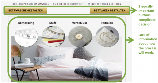
- 2 equally important buttons forced users through an extra decision loop.
- Lack of information about the process caused users to wonder how it works.
Changes we made based on the insights:
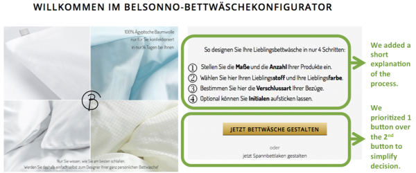
- We emphasized one button by reducing the second button to a text link.
- We added an explanation on “how it works” to reassure users and encourage them to proceed.
2. Enable users to easily navigate back and forth in the flow
User tests revealed that users had a hard time moving back and forth in the 4-step flow, resulting in many of them losing interest and abandoning the wizard.
Insights from user research:
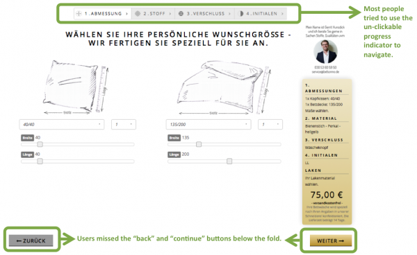
- Most users attempted to navigate from one step to the next by clicking on the non-clickable progress bar. They hadn’t noticed the “back” or the “continue“ buttons at the bottom of the page:
Changes we made based on the insights:
- The solution was obvious. We made the progress bar clickable to ease navigation and allow users to easily move from one step to the next:
3. Describe product benefits in customers’ language
Technical terms and lists of features can scare users away. Just read this list:
- 100% mercerized Egyptian cotton
- Thread density of 200-60 TC
- Long-staple cotton
Insights from user research:
- These features don’t help prospects understand what makes the bed linen desirable and worthwhile to buy. Research revealed that many users were intrigued by the features but didn’t quite understand their exact benefit.
Changes we made based on the insights:
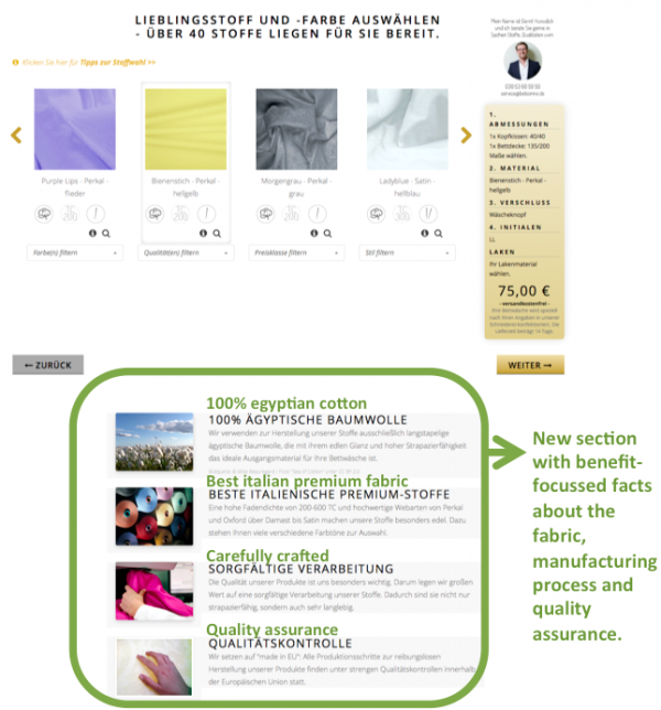
- One of belsonno’s founders, Gerrit Hunsdick, explained the nature of their fabrics to us. We distilled his incredibly profound knowledge into a few easy-to-understand points about the fabrics, manufacturing, and quality which we added to an entirely new section:
4. Promote the hidden treasures we always find
We have a passion for uncovering hidden treasures. A hidden treasure is something that is of value to users but is not yet communicated or properly promoted to visitors.
Insights from user research:
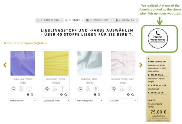
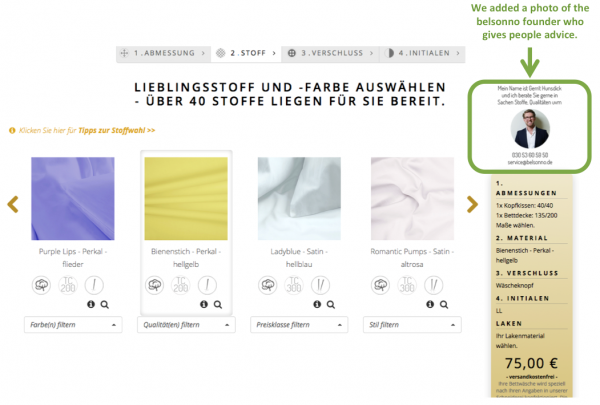
- Most visitors had a lot of unanswered questions when they arrived on the page asking them to choose the fabric. But hardly anyone considered calling the phone number advertised on that page to ask for advice. Much to our surprise we learned that it was actually one of the founders, Gerrit, the guy who knows everything about fabrics, who picks up the phone to advise people on the right fabric choice.
Changes we made based on the insights:
- To attract more attention to the phone number, we replaced the impersonal phone icon with Gerrit’s photo and name.
5. Price is not the only factor determining the perceived value of an offer
Almost every time we conduct user research, pricing is a topic that comes up. Statements like “it’s too expensive“ are common. When you work on increasing the value perception, attempt to do so without reducing prices; instead, let users know what’s included or what makes your offer special.
Insights from user reseach:
- In belsonno’s case, user testers voiced the common concern that the products are too expensive. The wizard contained no information about the manufacturing process and the quality of the product, which inevitably led users to compare the price of the unique bed linen with “off-the-shelf” products.
Changes we made based on the insights:
- We created a new page that explains the “journey” of tailor-made bed linen to add more value. This journey starts with the creation of a favorite product in the wizard and ends with the joy of sleeping in a unique set of bed linen personally designed to your needs.
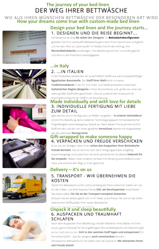
New page that explains the journey of belsonno tailor-made bed linen.
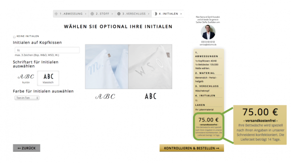
- In addition to the “journey” of the bed linen, we placed the following value-adding text directly below the price and close to the “add to cart” button:
“Your individual bed linen is manufactured by our tailor according to your specifications. The delivery time is 14 days.”
Lessons learned:
- Avoid having users rethink decisions by making it a no-brainer to get started.
- Make it easy to navigate back and forth when users design their own products.
- Sell benefits not features, so prospects understand “what’s in it for them.”
- Look for the “hidden treasures” in your company and promote them.
- Get the value of your offer right before you start reducing prices.
Big thanks to the belsonno team
We’d like to thank belsonno for allowing us to share some details of the work we have carried out with them. Watch this 2-minute video to see what it was like to work with us.
Want to understand how we can help grow your business?
Just get in touch if you want to see how we can work together to tackle your website’s challenges or if you want to learn how to better understand your users.
