How we seduced women to dress up (and grew conversions by 250% in 3 months)

August 5, 2014
This case study is all about getting women to put on some clothes. Not just any clothes, but exquisite designer dresses that they can rent for a few days and then return.
The German startup Laremia is basically every woman’s dream closet – filled with beautiful, high-end dresses. It allows fashionable women to wear a new designer gown for every occasion by simply renting it for a small fraction of the retail price.
In February Laremia’s founders approached us to help them turn more visitors into customers. Fast-forward 3 months: Their conversion rate is up 250%.
Here is how we got those improvements:
STEP 1: GET INSIDE WOMENS’ MINDS (yes, it is possible 🙂 )
Conversion optimization isn’t about optimizing Web pages – it’s about optimizing visitors’ decisions. That’s why we always start with a thorough user research review.
Laremia was no exception. In fact, we dedicated lots of our time to truly understanding the psychology of their users. It took us about 3 weeks (and less than 200 Euros!).
Our focus was on dissecting:
1. What prevented visitors from clicking the “buy now” button?
2. What convinced happy customers to rent a dress from Laremia?
Discover all of the techniques and tools that we used to answer these questions in this blog post: Get Amazing Insights About Your Visitors Even if You Have ZERO Budget for User Research.
STEP 2: FIND THE HIDDEN OBJECTIONS
During our discovery phase several user concerns surfaced. We’ll look at two of them now.
Objection 1: Will the dress fit?
What could be worse than realizing that a user’s dream dress does not fit shortly before her important occasion? This was a serious concern – but one that we could eradicate easily (you’ll see how in a minute).
Here are some examples of pain points that our Voice of the Customer study revealed.
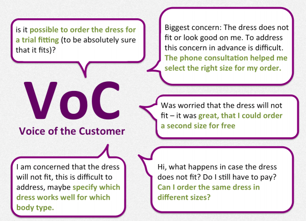
Examples of Voice of the Customer feedback we got during our research phase. View German original here.
Notice how many of the ladies who voiced a concern also offered a solution (marked in green). We will use these ideas when we get to step 3 and start addressing these concerns.
Objection 2: Is it a good deal?
This is a very common objection: actually it almost always comes up in our user research. I guess it’s part of human nature to worry that we might not get a good deal. The good thing is that there are typically easy solutions to increase the value perception – without actually lowering the price.
Our research uncovered all sorts of benefits of which most visitors were unaware (but that happy customers loved):
– dry cleaning is included (Laremia takes care of that)
– there is an option to receive a second size for free with every rental
– it is possible to order up to 3 dresses for free trial-fitting before an event
– free shipping
– money back in case you change your mind and don’t wear the dress
This feedback from happy customers gave us nice clues on what we needed to communicate more prominently to help us increase the value perception.
STEP 3: ADDRESS CONCERNS LOUDLY AND CLEARLY
We needed to get two messages across:
1. you will find a dress that fits – guaranteed
2. this is great value for your money
Here are three examples of how we did it. They were part of several changes that contributed to the 250% uplift in conversions within 3 months. Please be aware that optimization is a continuous process. Laremia keeps running tests with Optimizely and is constantly testing new stuff in order to build on previous successes.
EXAMPLE 1:
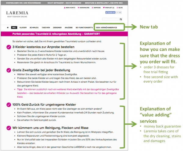
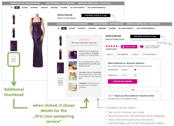
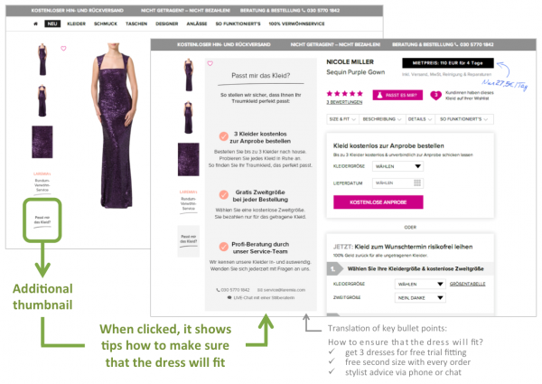
We introduced a satisfaction & first-class service guarantee
This allowed us to spread both key messages (“you’ll find a dress that fits – guaranteed” and “this is good value for your money”).
Once we learned that the guarantee message worked well, we added it on several pages and page elements…
…in the main menu with a dedicated page explaining the details:
…as a thumbnail next to the product image – once with emphasis on the guarantee / pampering service:
…and again as a thumbnail next to the product shot – another time with emphasis on how you can be sure that the dress will fit:
EXAMPLE 2:
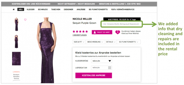
We communicated more prominently that dry cleaning is included
To increase the value perception we added a small sentence right below the rental price stating that dry cleaning and small repairs are included:
EXAMPLE 3:
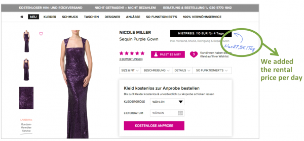
We added the price per day to increase the value perception
As a follow-up, we also prominently displayed the rental price per day:
Actionable advice
Once you find a winning element, try to re-apply it to multiple pages, elements and flows.
When you work on increasing the value perception, attempt to do so without reducing prices; instead, let users know what’s included.
A few words from Laremia
Check out this 2-minute video: Laremia’s founder, Claudia Freifrau von Boeselager, and COO, Carsten Petzold, describe what it was like to work with us (can you believe we actually never physically met?) and what results we achieved together.
How we can help you to grow your online business?
– Subscribe to our newsletter to receive more case studies and tips that might inspire you to run tests on your site.
– Contact us if you’d like us to optimize your business.
