Case Study: How We Changed One Sentence and Grew Mobile Conversions by 25% (Plus, What Led Us to Test It)

June 9, 2016
Looking at the winning version of an A/B test, the changes that led to the conversion uplift often seem so obvious. Looks, though, can be deceiving: What seems easy and logical actually requires canny groundwork. You need to X-ray your users. The better you understand what is going on in their minds, the easier it is to know what changes on your site will help to grow your business.
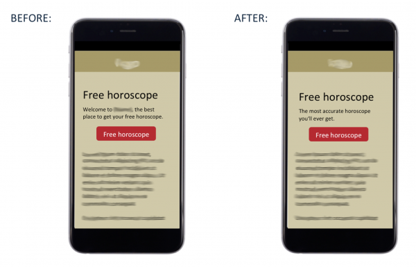
Can you spot the difference?
In this case, the difference is not so obvious, but the tiny change produced a huge uplift. Let us explain….
How we found out what we needed to change
During our research phase, we uncovered two key insights:
First, we noticed on the heat maps that the call-to-action button was the only area that got attention and taps (with some small exceptions in the header section).
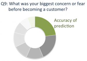
Second, we got an interesting insight from a survey we sent out to existing customers. Answers to one of the questions revealed what was the customers’ biggest concern before they signed up to receive free horoscopes: the accuracy of predictions.

The feedback from existing customers revealed their biggest fear before becoming a customer: the accuracy of the predictions of the horoscopes
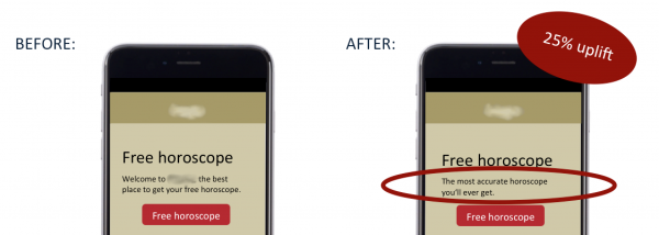
Next, we combined the two insights. To reassure users that they would get accurate horoscopes we made sure to communicate this important message. Then we placed it right next to the hotspot from the heat map: the call-to-action button.
This almost-invisible change produced a conversion uplift of 25%. This might seem tiny when you look at the before-and-after image, but it is a big change in the sense that it addresses one of the key objections the users had before they tapped on the button.
Our tiny secret to successful A/B testing
Over and over, we have experienced that the biggest wins can be achieved when you do your detective work first: Find out what bothers the user and then address the issue head-on. It pays to spend some time on user research first rather than randomly testing right away.
Interested in user research tips?
- Get Amazing Insights About Your Visitors Even if You Have Zero Budget for User Research
- Shhh! An Unheard-of Technique to Collect Feedback from Your Prospects on Facebook
- 7 User Research Techniques That Also Work on Low-Traffic-Sites
Want help to grow your business?
Just get in touch if you want to see how we can work together to tackle your website’s challenges or if you want to learn how to better understand your users.


